Appearance
The Appearance tab allows you to customize the visual elements of your agent to seamlessly blend with your website's brand.
Presentation (Chatbot, Copilot, Sidebar)
The Default Presentation setting controls how your agent appears on your website.
- Chatbot: A traditional corner chat widget that expands into a chat window.
- Copilot (Business): An inline assistant that appears at the bottom center for a guided experience.
- Sidebar (Business): A full-height sidebar that slides in and pushes page content (similar to Chrome DevTools).
Sidebar collapsed style
When using Sidebar, you can choose how the collapsed state looks:
- Chat Bubble: A classic floating bubble that expands into the full sidebar.
- Copilot Bar: A minimal inline bar that expands into the full sidebar.
Copilot and Sidebar presentations are optimized for desktop. On mobile devices, Aimdoc will fall back to the standard chat widget experience.
Position
Choose whether the widget appears on the bottom-left or bottom-right of the page. In Sidebar view, this controls which side the sidebar opens from.
Logo
Upload your company logo for consistent branding.
- Format: We recommend a transparent PNG for the best look.
- Placement: The logo appears at the top of the chat window and in the header.
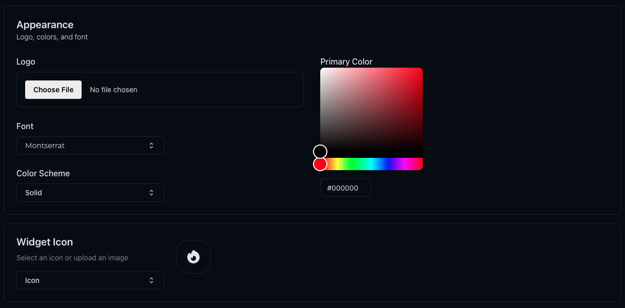
Font & Color Scheme
Choose a font and colors that complement your brand identity.
Font
Select from a list of web-safe and popular fonts (e.g., Montserrat, Inter, Open Sans).
Colors
- Primary Color: The main color used for the chat header, user messages, and buttons.
- Gradient End Color: If you want a gradient effect, select a second color. For a solid color, set both to the same value.
Use contrasting colors for better visibility and engagement.
Widget Icon
Customize the icon that appears when the chat widget is collapsed (minimized).
- Default Icons: Choose from a library of built-in icons.
- Custom Image: Upload your own icon or avatar image to make the widget unique to your brand.